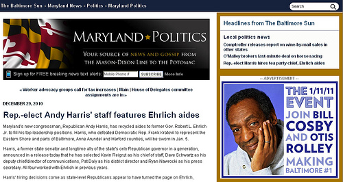
Following the 2010 elections I attended a post-election presentation at Google’s D.C. office where some very smart internet strategists touched upon the future of online political advertising. Many saw the upcoming 2012 as the tipping point in online advertising. However, so far campaigns have been very reluctant to spend even a small fraction of their advertising budgets online and have relied instead on television and radio. I could go on about the challenge that web consultants face when it comes to getting buy-in for online advertising but for now I’ll focus on one recent example of how NOT to run an ad campaign if you’re lucky enough to get buy-in. This may even be an example of why candidates don’t trust web consultants with larger online ad budgets.
Last December I started seeing ads for “THE EVENT on 1/11/11,” a fundraiser for Baltimore Mayoral candidate Otis Rolley. “Join Bill Cosby and Otis Rolley” it read, “Making Baltimore #1”. It definitely caught my attention with Bill Cosby’s unmistakable smile and the gimmicky, yet effective, event date. Curious about THE EVENT, I clicked on the ad and was taken to this page. If I happened to be someone who just really loved Bill Cosby or even an Otis Rolley supporter and I wanted to buy a ticket before it sold out, you might have lost me on that page. Maybe not, but you’re certainly making it harder for me to give you my credit card information. My point is that users and donors are fickle and easily distracted. You have to make it reaaaally easy for them to give you money. To be fair, the ad on the subsequent page is clickable and it eventually takes you to an Act Blue page, but why bother with showing users the ad again? You’ve already gotten them to click on the ad and the information they’re really looking for (cost) is down at the bottom in size 11 font. You might even have to scroll down to see it. At the end of the day you’re paying The Baltimore Sun for this space – for this kind of ad – to get conversions, not just impressions.
If you’re a political campaign that is sold on the idea of online advertising and you want to get the most bang for your buck, try to make it as easy as possible to get those conversions. Whether its email addresses, Facebook fans, or contributions, link directly to the page or form where users can give you something. While it isn’t the prettiest, the
Act Blue page has all of the essential information for me to make a decision and complete a transaction. If you want to take it a step further, link directly to the
online contribution form. Act Blue, NGP, Salsa, Blue State all have contribution packages with quick and easy forms to accept individual contributions and even ticketing for events. Does your candidate insist that you include that fancy ad and photo of the celebrity? No problem, some of these tools even allow you to customize the forms with images, maps and files. Just remember to link directly to the form and try not to distract me when I get there. That puts me one step closer to pulling out my card and looking for that expiration date.

